In my previous blog post, “Warum man im Sommer nicht nach Taiwan reisen sollte” (Why You Should Not Travel to Taiwan in Summer), I showcased two different types of climate diagrams, which are also referred to as climate charts or climate graphs. In this article, I’ll explain what these diagrams are and how I created them.
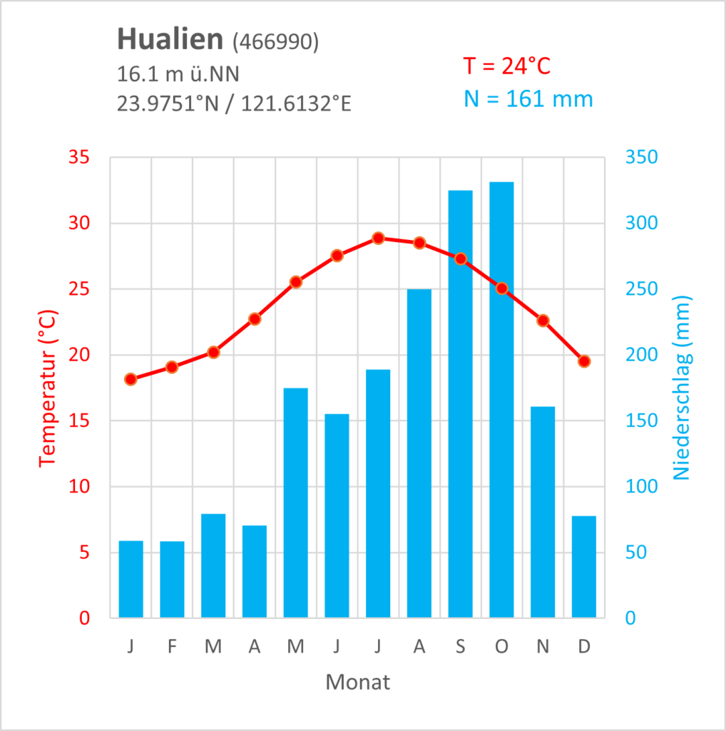
Climate diagrams are visual representations of climate data that illustrate both the average monthly precipitation and the average monthly temperature for a given location. Typically, these diagrams include a bar chart in blue to represent the average monthly precipitation and a line graph in red to depict the average monthly temperature. Additionally, some diagrams may display annual averages and provide location information within a text box. The type of diagram I used is based on those developed by Wladimir Köppen.
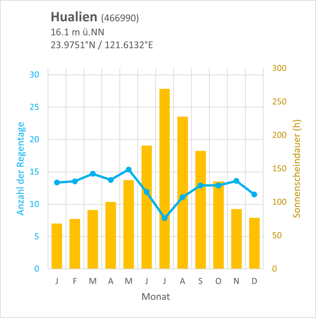
In addition to the standard climate diagram, I also created alternative diagrams that display the average monthly duration of sunshine and the monthly average number of rainy days. While not standard climate diagrams, I thought that including these values could be useful in determining the best time to travel to Taiwan.
I used both R and Excel to create the climate diagrams. R is ideal for data analysis and visualization, while Excel is widely used for basic charts and graphs. First, I obtained climate data for Taiwan from public sources and imported it into R. Next, I extracted and manipulated the necessary data using R and completed the final data manipulation in Excel. I used Excel to create the graphs since I found it more straightforward in this instance, though it is possible to complete all tasks in R.
How to Obtain Data for Creating Climate Diagrams
To create a climate diagram, continuous weather data for a 30-year period from one location is needed. In this blog post, the data used was provided by the Central Weather Bureau Taiwan and covers only the years from 1995 onwards. Unfortunately, for some weather stations, the data was incomplete or missing. To keep the weather data consistent for all stations, monthly and yearly averages were calculated for a 20-year period from 2002 to 2021. As a result, the climate diagrams presented in this article may differ slightly from those found elsewhere.
To access the raw data, visit the CWB Observation Data Inquire System website, which is in Chinese. However, translation plugins for web browsers make navigation relatively simple. The results are presented as a table in a new tab, and CSV-files can be downloaded directly from the table.
For this article, 10 weather stations from across Taiwan were selected to represent different geographic locations and climate zones. The yearly data was downloaded in CSV-format for each station, resulting in 20 files per station and a total of 200 CSV-files.
Data processing and creation of climate diagrams
For creating the climate diagrams, I needed to process weather data for 10 different weather stations over a 20-year period and across 200 CSV-files. Doing this manually in Excel would have been a time-consuming task. Therefore, I wrote some scripts in R using the tidyverse package to process, extract and combine the data. I’m still learning how to use R properly, and I think there is still room for optimization of my scripts for managing large datasets. To ensure data reliability, I preferred a step-by-step approach that allowed for error checking at each stage of the process.
Select columns for further data analysis
Firstly, I selected the relevant columns for further analysis. The raw data contained 35 columns with various weather parameters, but not all of them were needed for creating climate diagrams. Additionally, the first row contained column names in Chinese, which had to be removed. To avoid manual work and reduce errors, I created a script that reads all files in a folder, performs the necessary modifications, and stores the new data in a new file.
# set working directory
setwd("C:/XXX/XXX/")

# read file names in the folder and store them in a vector
filename <- list.files(pattern = '.csv')

# loop to do things for each file and save the result in new table
for (i in filename){
  table <- read.csv(file = i, skip = 1,
                    na.strings = c("...", "X", "/"))   # load table and skip first row
  year <- str_sub(i, -8, -5)                           # extract year from filename
  locationID <- str_sub(i, end = -10)                  # extract location ID from filename
  table1 <- select(table, ObsTime, Temperature,
                   T.Max, T.Min, Precp, PrecpDay,
                   RH, SunShine, Cloud.Amount)         # select columns and store in a new table
  table2 <- mutate(table1, locationID, year)           # add new columns with year and location ID
  path <- "C:/XXX/YYY/"                                # create file path to store the new file
  new_file <- str_c(path,i)                            # filename and path for the new file
  write.csv(table2, file = new_file)                   # save new table
}
Merge single tables into one big table
The previous step still left me with 200 individual tables, although much smaller. The next step was to merge the tables for each weather station into a single table using this code:
df <- list.files(path = "C:/XXX/XXX/") %>%
  lapply(read_csv, col_types = cols(.default = "d", locationID = "c")) %>%
  bind_rows

write.csv(df, "C:/XXX/XXX/merge.csv")
Calculating averages
The last step in R was to calculate the monthly averages for each column and all tables. To accomplish this, I utilized the merged files that I copied into the same folder and ran the following code:
# set working directory
setwd("C:/XXX/XXX/")

# read file names in the folder and store them in a vector
filename <- list.files(pattern = '.csv')

# loop to calculate averages for each column and save the result in new tables
for (i in filename){
  table <-  read.csv(file = i, na.strings = c("...", "X", "/", "NA"))   # load table

  # summarize data and calculate averages
  avrg <- table %>% group_by(Month) %>%
    summarize_at(vars(Temperature:Cloud.Amount), mean, na.rm = TRUE)

  # create file path to store the new file
  path <- "C:/XXX/ZZZ/"
  new_file <- str_c(path,i)              # filename and path for the new file
  write.csv(avrg, file = new_file)       # save new table
}
Creating climate diagrams in Excel
The final steps of creating the climate diagrams were done in Excel, as I found it more convenient for this task. First, I rearranged the columns in the data file and added a new column with the name for each month. Then, I created a template for the climate diagrams so that the same style could be used for each location. This allowed me to quickly generate 10 regular and 10 alternative climate diagrams for the blog article.
Once the diagrams were completed, I exported them as PNG-files from Excel using the function “Save as picture,” which can be accessed by right-clicking on the diagram.
Final Remarks
These were the main steps in creating the diagrams and preparing the data. With these scripts, I can now process data from other weather stations quickly and generate new diagrams. There is definitely room for improvement as the scripts can be streamlined. Additionally, the entire process, including creating the diagrams, can be done in R using ggplot2. However, I find exporting graphs from R using ggplot2 a bit tricky as it requires a lot of fine-tuning until everything looks right. In this case, Excel is easier to use because it provides a visual representation of what you will get.
I hope that my process is clear and understandable and that it proves useful to someone. As I mentioned, I am still learning and would appreciate any good advice.
If you like this content and don’t want to miss new blog posts, consider subscribing to our newsletter!